AquisNet SYS/REP (NEW)

|
General Usage |
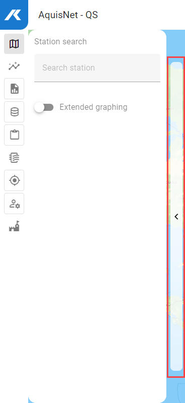
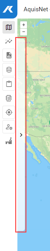
Scroll
 | |
|
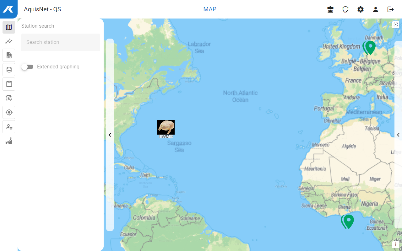
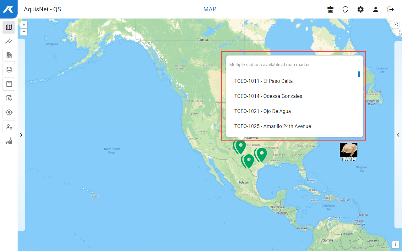
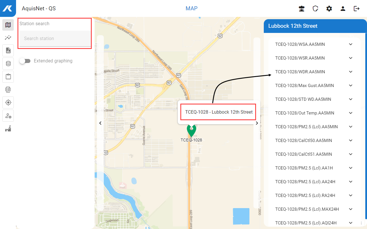
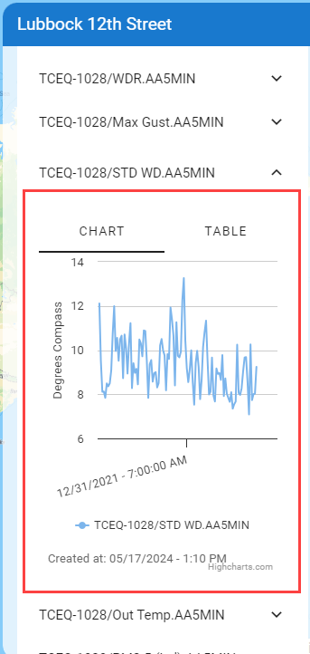
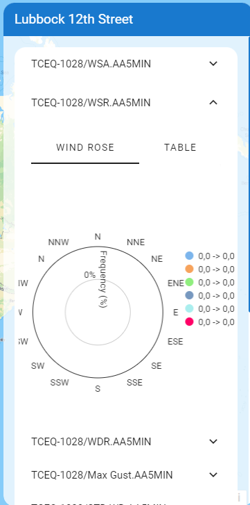
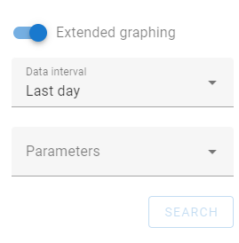
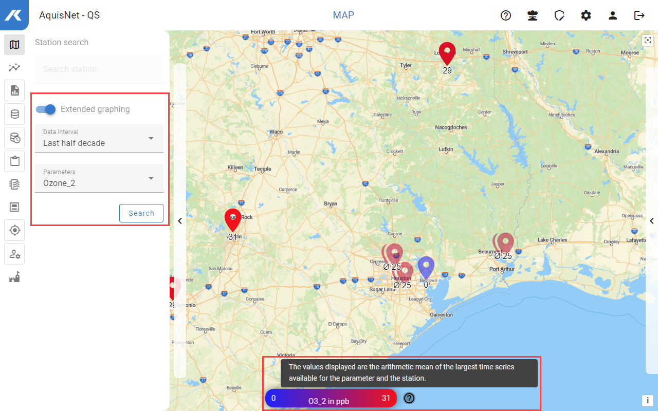
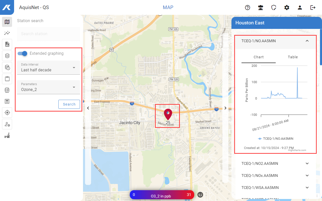
Below, a few basic principles are described for using the system's user interface. This includes, for example, the function selection, the navigation bar, the map function or the station search.