|
Display graph and table |
Scroll
 | |
|
You have now selected one or more time series for viewing and defined a time range for the display.
▪Now click the [View] button, or
▪select the Default view function from the context menu of the time series selection window,
▪or the same function from the main menu item Graph.
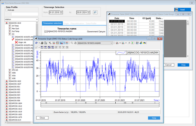
A corresponding graph and table is output for the selected time series:
More options
Tables and graphs also offer a range of further convenient functions:
▪All functions within the graph can be executed by the buttons in the Graphic window or by the context menu (to be opened with the right mouse button).
▪You can view and print the data in the graph at an arbitrary resolution using the zoom function. The time series to be represented can be combined as you like and the type of representation can be configured freely.
▪You can combine any number of time series you like in one graph and choose different kinds of display for each of these time series.
▪You can also reload your current time series into the graph to update the view when the database has been updated with new measured data.
▪You can edit the values in the table by editing single cells just as you would a spreadsheet.
▪Values of time series that are not being edited yet, always appear in grey at first.
▪Non-editable values of time series which are being edited are shown in grey; editable values in black.
Measured values of non-editable time series always appear in grey in the table.

