AquisNet DMO

|
Display time series in the data collection center DMO |
Scroll
 | |
|
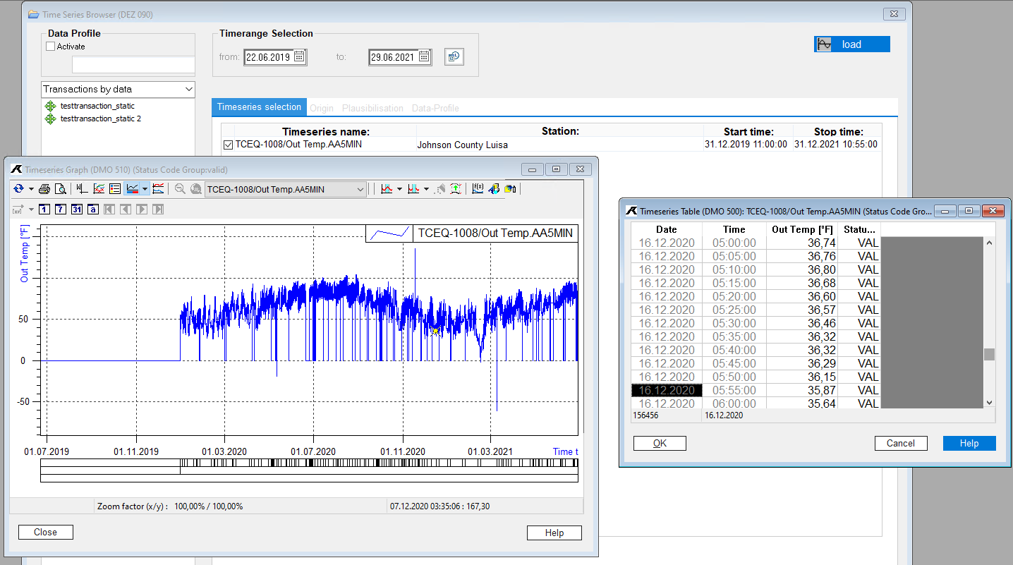
There are two visualisation elements in the AquisNet data collection center DMO: the time series graph and the tabular representation. The editing of the time series is done interactively.
In this chapter you will learn how to represent time series from within the DMO in tables and graphs and how to format and design graph and table views for your interactive editing.
The chapter will explain how to insert and edit user-defined graphical elements (for example lines, arrows, rectangles, texts).
You can view any number of time series with measured values in one or several graphs or tables (one graph or one table each per time series):
▪Open the AquisNet time series browser.
▪Select the desired view for the tree view in the drop-down list box of the same name in the upper left corner of the browser,
▪and select a time series by double-clicking.
▪Set the time range of the data that you want to display in the graph/table.
▪Select the View function using the [View] button, or using the Default view entry in the context menu, which you can open using the right mouse button.
The Graph or Table dialog opens. The measured values of the selected time series within the specified time range are displayed.
You have now selected one or more time series for viewing and defined a time range for the display.
▪Now click the [View] button or
▪select the Default view function from the context menu of the time series selection window,
▪or the same function from the main menu item Graph.
You get the time series browser and the Show graph and Show table reports combined on the screen:
▪To enlarge the Display graph report, expand the report to screen size.
▪To enlarge the Display table report, expand the report to screen size.
The representation of the time series within DMO is explained in the following chapters:
▪Manual validation of measurement data
▪Transaction for saving changes
▪Automatically adjusting the value range
▪Specifying axis and plot ranges
▪Insert user defined graphical elements
▪Filter time series graph using an error code group
▪Visualise changes in time series (e.g. transactions)